Branding project to shake off drowsiness
The concept behind RAWR coffee goes far beyond that of a simple coffee shop. It’s a rustic, youthful setting where you can unwind, enjoy your first cup of coffee of the day (or your fifth), and shake off that groggy feeling so you can start your day with energy.
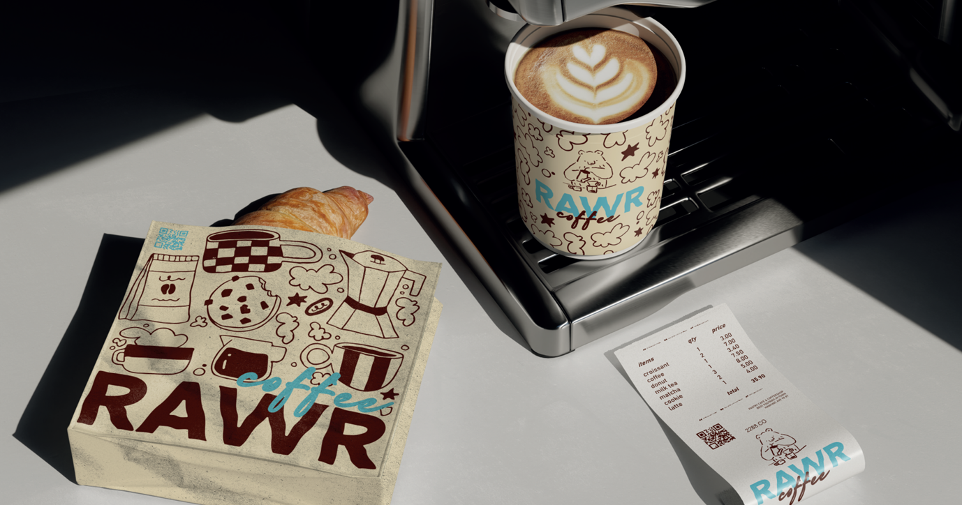
The branding for this project included a complete rebranding, as well as the creation of custom materials—from takeout pastry bags and paper and reusable coffee cups to the receipts from the counter printer. Although the location has tables and chairs, customers can always choose the takeout option, and it is crucial for the brand to ensure its philosophy is reflected everywhere. Additionally, customers will be provided with paper tablecloths for the trays they take to their tables with their food served on plates.
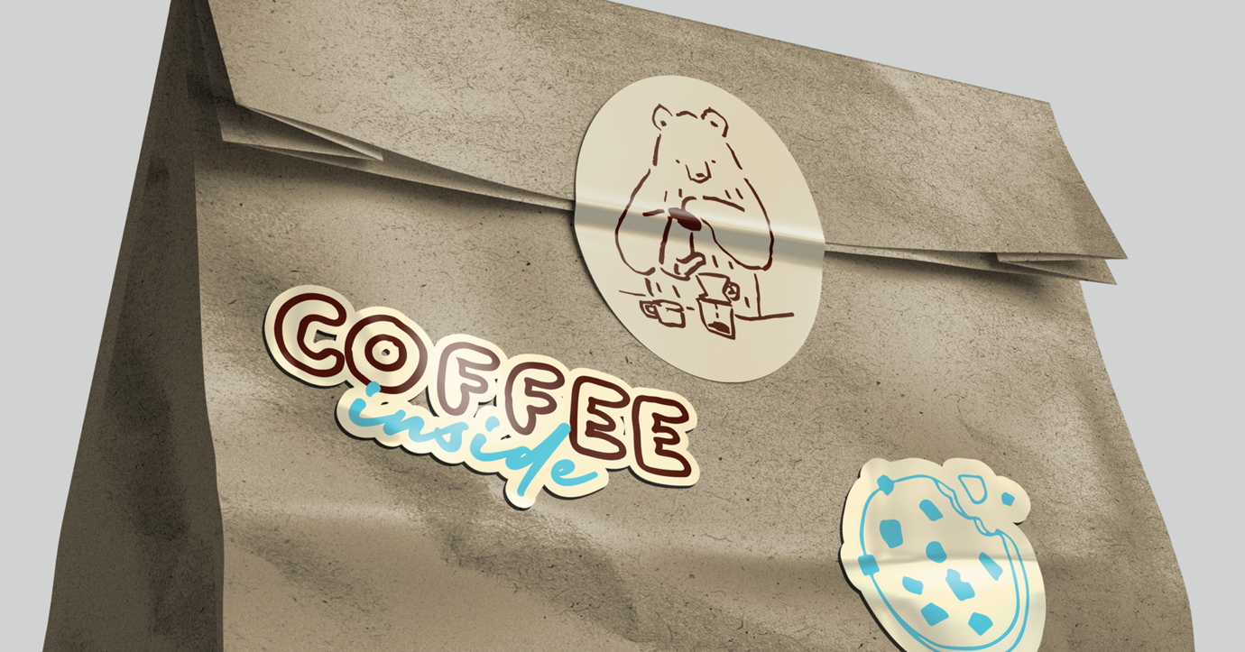
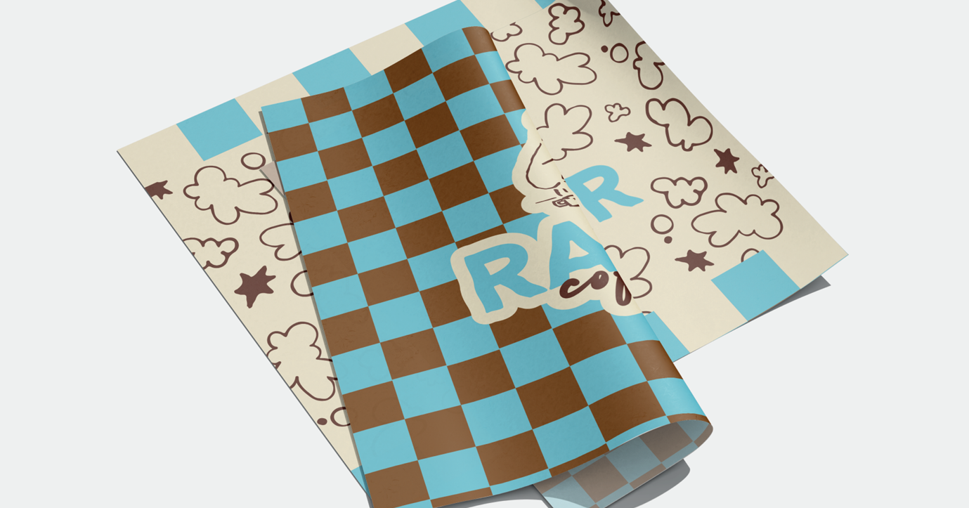
The brand’s colors were chosen to contrast the brown of coffee—which is associated with a connection to the earth, tranquility, and even calm—with sky blue, a complementary color that subtly breaks away from those emotions, bringing energy and a more uplifting mood.
Brand Meaning
The bear has been used as a brand image to symbolize the state of lethargy following hibernation, which contrasts with that first cup of coffee in the morning that energizes you and gets your day off to a good start. The company has a youthful, energetic image that really connects with its customers. For this reason, hand-drawn graphics have been used to create a warm, familiar, and friendly style.